add-on

Productizing a recurring behavior
In recent years, we observe that backers tend to “overpledge” (pledge for an amount higher than the minimum asked) for rewards on Kickstarter. Overpledge accounted for 4.1% of Kickstarter’s revenue in 2019, approximately $1.2M.
Much of this overpledge behavior could be attributed to add-ons – optional mini-rewards that backers can choose to add to their main rewards.
Existing workflow was a nightmare
Despite much friction, this unsupported, user-generated functionality continued to prevail on our site. A quick browse through most campaign descriptions, you’ll find extensive information about available add-ons, accompanied by big add-on graphics.

Creators then ask backers to add $X to their pledges for add-on A, $Y for add-on B. Backers had to do the math themselves, and creators had to sort out what add-ons to ship based on the additional amount. Needless to say, both checkout and fulfillment were a nightmare.
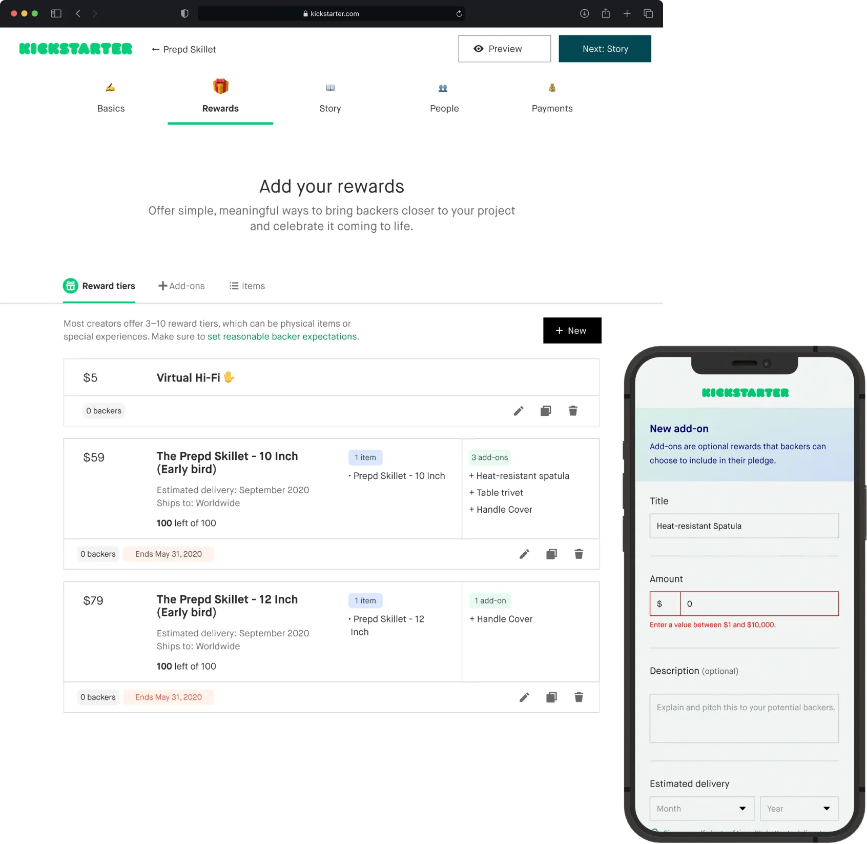
A multi-phased feature development plan
Productizing add-ons would touch many parts of the 10-year-old platform, from project build to checkout, creator dashboard to transactional emails. Our feature team, Creator Tools, had a multi-phased approach to developing the feature, starting with the highest-priorities, Checkout and Project Build.
I was brought on board while the development of checkout with add-ons was in flux. For the next few months, I would be the sole designer for all checkout edge cases, secondary UIs, transaction emails, and most importantly, the add-on creation flow for creators.

Narrow in on one direction
Add-on was a fairly well-scoped project. As a team, we explored several UX concepts that I crafted. I worked with my PM and Eng Lead to figure out business and technical trade-offs. We also did some quick concept testing with creators. After discussions, we finally landed at Concept 3, the Rewards Management tab.

Leverage quantitative data to design adaptive, resilient UIs
Creators need a way to build and manage add-ons. Traditionally, reward building has been done in Project Build, Kickstarter's campaign builder. We historically only supported 2 types of reward objects: reward and items. Add-on would be the third addition to this surface.
Before architecting this experience, I wanted to gain a full understanding of the current UI's scope. What’s the average/min/max number of rewards per launched project, sliced by categories and funding tiers? How many items does each reward have on average/at min/at max? What percentage of projects itemize their rewards?
I wanted to design an experience that was resilient to errors and edge cases, that served the 80% case just as well as the 20% case. For a feature that deals with lots of numerical data, this was a core UX principle.

The cell design went through many iterations. I made extensive use of iconography for edit actions and created a system for color-coded pills. The cells also had gone through a bunch of accessibility and UI pressure tests.

Creators equate add-ons with items, not rewards
With this feature, I placed great emphasis on rapid testing and iterations. From April to June 2020, I did a total of 3 rounds of testing and design iterations, trying out the feature with 10 creators from different funding tiers and categories, from under $5K to over $100K, games to publishing, independent to big-named creators.
Through rapid testing, we were able to:
- Validate creators’ desire to custom assign add-ons to rewards, which was originally scoped out
- Discover that creators perceived add-ons as singular items, not reward tiers

Creators can quickly turn an item into an add-on
I worked on various concepts for the assign add-on interaction. After some light-weight test, I settled on incorporating the interaction in the add/edit flow because it caused the least amount of friction.

Create and assign add-on interaction

Create add-on full page

New rewards table with add-ons

Launch is not the end
The feature was launched in Beta to selected creators in September, 2020. Both creators and backers were excited and it showed.
$6.5M
Total add-on backings
80%
System usability score (SUS)
30-50%
Increase in average pledge amount for projects with add-onsz
30%
Creator adoption
High-impact, low-lift UX improvements
Looking through survey feedback, we noticed that many backers, especially experienced backers, were confused as to where during checkout add-ons would be presented. I designed these add-on pills as a quick fix to the issue. Although we'd eventually want to incorporate add-ons into the project page, we wanted to see if this simple solution would address immediate concerns to some degree.


New reward card with "add-on" pill
Another high-impact, low-lift UX improvement was the tab redesign. We noticed that creators were having trouble discovering the new add-on tab due to low interactivity. I originally repurposed an old Kickstarter tab pattern, but since it proved to hinder discoverability, I decided to redesign the entire tab navigation UI on this page.
You can see the new tab design with icons for callout and clarification below: